Rollerball Pen Groen 0.3mm – Schneider #8614 Topball 861

PEN GROEN 03 “TOPBALL 861” SCHN#8614

SRD 32,75

18 in stock

19 People watching this product now!

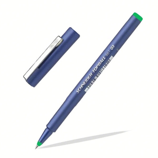
De Schneider Topball 861 Fineliner met een extra fijne punt van 0.3mm in een klassieke blauwe kleur is de perfecte pen voor iedereen die detail en precisie eist van hun schrijfgerei, of je nu scholier bent of professional. Deze fineliner glijdt soepel over het papier en levert een consistente, ragfijne lijn, ideaal voor het maken van gedetailleerde aantekeningen, technische tekeningen, outlines of het schrijven in kleine ruimtes. De heldere blauwe inkt zorgt voor goed leesbare tekst en maakt deze pen een uitstekende keuze voor zowel schooltaken als professionele documentatie waar duidelijkheid essentieel is.

Kleur6120
Merk6074
Afmeting-1

Online Sports Nutrition and Natural Dietetics.

Chances are there wasn't collaboration, communication, and checkpoints, there wasn't a process agreed upon or specified with the granularity required. It's content strategy gone awry right from the start. Forswearing the use of Lorem Ipsum wouldn't have helped, won't help now. It's like saying you're a bad designer, use less bold text, don't use italics in every other paragraph. True enough, but that's not all that it takes to get things back on track.

The villagers are out there with a vengeance to get that Frankenstein

You made all the required mock ups for commissioned layout, got all the approvals, built a tested code base or had them built, you decided on a content management system, got a license for it or adapted:

  • The toppings you may chose for that TV dinner pizza slice when you forgot to shop for foods, the paint you may slap on your face to impress the new boss is your business.
  • But what about your daily bread? Design comps, layouts, wireframes—will your clients accept that you go about things the facile way?
  • Authorities in our business will tell in no uncertain terms that Lorem Ipsum is that huge, huge no no to forswear forever.
  • Not so fast, I'd say, there are some redeeming factors in favor of greeking text, as its use is merely the symptom of a worse problem to take into consideration.
  • Websites in professional use templating systems.
  • Commercial publishing platforms and content management systems ensure that you can show different text, different data using the same template.
  • When it's about controlling hundreds of articles, product pages for web shops, or user profiles in social networks, all of them potentially with different sizes, formats, rules for differing elements things can break, designs agreed upon can have unintended consequences and look much different than expected.

This is quite a problem to solve, but just doing without greeking text won't fix it. Using test items of real content and data in designs will help, but there's no guarantee that every oddity will be found and corrected. Do you want to be sure? Then a prototype or beta site with real content published from the real CMS is needed—but you’re not going that far until you go through an initial design cycle.